What Do Supervised and Unsupervised Actually Mean in Machine Learning?

In machine learning there are many umbrellas that refer to different processes or set ups for the “learning” to take place. Today’s discussion will surround two commonly used umbrella terms, supervised and unsupervised learning. In this case the process or set up being referred to actually lays within the raw data itself.

When setting up a machine learning project, there are a few considerations that shape the nature of the project. The first is the type of data available, either categorical or continuous. The second is whether or not a ground truth is available. It should be noted that not all numerical data is continuous. The commonly used Likert scale testing, answering a question with a response of 1 to 5 with one being the worst and five being the best, is actually categorical data, because there is no float type, like 1.5034, answer possible. This 1.5034 response would be sorted into either the 1 or the 2 category, making the data type categorical. Whereas in the continuous datatype, any number along a number line or curve is a valid data point. An example of categorical data in the field of oil and gas, specifically in drilling, is lithology. An example of continuous data would be something like mechanical specific energy (mse) or weight on bit (wob). Whether the type of data is categorical or continuous is only one consideration. Additionally, there needs to be a decision about whether or not there is some sort of “ground truth” associated with the data.

This “ground truth” functions like an answer key in that you, as the human, already know the correct answer before asking the question of an artificial intelligence or constructing the machine learning model. One version of this is having labeled data available for categorical data, such as having the lithology determined for every depth when trying to classify lithology. Another version would be having something like a wire line log available to compare a predicted wire line log against. Having this ground truth available for use, means that a supervised machine learning model can be selected. Otherwise when this type of “ground truth” data is not available, the options for a machine learning project are restricted to only unsupervised machine learning techniques. If you have this answer key, you can choose either a supervised or unsupervised approach, or sometimes both, to see which will yield better results, and you can actually use both to have them compete against each other in a reinforcement learning scenario. Basically, if you start with some knowledge that is reliable in the real world, a “ground truth”, then you have more options in creating your artificial world using machine learning.

With this in mind, data quality is a huge consideration when embarking on a project. If there is partial labeled data available, is it enough to construct a supervised learning model? Or would an unsupervised approach be better with wider access to include the unlabeled data? One way to assist in making these decisions is to consider the problem being addressed. Has any work been done before to connect any of the variables or features at play? What is the nature of this relationship? Is it predictable? In the case of oil and gas, which uses geomechanical properties that have been studied for over a century, often times this answer lies within the physical relationships being studied. Meaning that sometimes, there’s a way to solve for a missing label algebraically. This takes some time in writing the code to execute that formula, but also it means working closely with someone like a petroleum engineer to make sure that all of those geomechanical relationships are being referenced and used appropriately. There’s also the additional step of associating that newly solved for label with the dataset being worked with. But this would take a dataset previously only being able to be used in unsupervised learning to having more options under a labeled dataset, now under the supervised learning umbrella.

Something that also plays into the decision about using a supervised or unsupervised approach is the testing or validation of that machine learning model. In supervised learning the testing is really easy. You just compare the results from the model to that “ground truth” or answer key to determine accuracy. There are some considerations to be had with under- and over-fitting, but at the end of the day, calculating that accuracy is just like your teacher grading your test in school. For some business questions, an accuracy of 70% is good enough. For other questions, often those with high risk associated with failure, an accuracy of 95% or better might be required. It should be noted that an accuracy of 100% definitely means that the model is overfit. This means that when introduced to a new dataset, the model will likely fail because it is different than the training dataset. This under- and over-fitting problem is a drawback to using a supervised approach, you have to hit that sweet spot of accuracy.

All of these considerations, while they still apply in unsupervised learning situations, are much more difficult to assess in an unsupervised environment. In this case, measuring some inherent statistical properties in model outputs and making sure that they are in line with other similar problems is a good route to take in determining model performance. In the case of unsupervised learning, the conversation surrounding accuracy is null and void because there’s no answer key. So the conversation must switch frame to answering the question of is this output realistic? Does is make sense? Is it reproducible and to what scale? Often times in unsupervised scenarios a multitude of models are generated to assess performance in comparison to each other. This is much like taste testing some food after selecting a different quality of ingredients for each preparation of the same dish. Some will behave similarly, others will be awful, and a few might be really good. There’s not really a way to know beforehand though that the store bought brand actually does better than the branded product, not until you try it. Each type of unsupervised machine learning model has its own metric by which it can be evaluated, and this is how comparison of or model performance is discussed in an unsupervised scenario. A discussion before beginning any modeling is in order to determine if that metric will do enough to assess performance to an acceptable standard.

With all of this in mind, conversations surrounding what data is available and how it needs to be evaluated will help in the decision making process of not only whether or not a machine learning option is a viable path forward, but also what type of machine learning algorithm to use, in making the decision about how to address a business question or need in industry. This conversation should also include what types of resources need to be dedicated to the problem. While all types of machine learning takes tuning, unsupervised learning models do present more challenge, and often require manpower and more computational time to generate the variety of models for comparison.

My Experience at URTeC 2021

Recently, I had the fortune to make a trip to Houston sponsored by Enovate Upstream to attend the URTeC 2021 Conference, despite only having had joined the company as a Research Data Scientist in April 2021. I was happy to attend and provide some technical insight into the machine learning and artificial intelligence that Enovate Upstream uses in their product offerings at the company booth. However, my attendance at URTeC 2021 led to much more for me individually.

So much happened on Monday, the first day of the conference. First it was really great to reconnect with the Enovate Upstream team. Early that morning, I walked with Ty Summers, John Estrada, and Laura Santos to view some of the booths that other companies had put up. I laughed as Ty asked John to explain what some of the companies were on about. With John’s strong background in petroleum engineering and Ty’s quick eye for design and the expression of content, their conversation was lively and light hearted. It was really nice to almost get a kind of personal tour from John guided by Ty’s questions, because I’m still quite new to this particular domain. While my background in chemistry allows me to understand what’s happening in petroleum engineering on a surface level, I still don’t yet have the ability to pick out the differences between drilling, production, and service companies.

After a short bout, Laura and I broke off to listen to a presentation given by Emerson. The presentation was really interesting, on the topic of what’s known as the “sweet spot”, and touched on an algorithm I’m familiar with as a data scientist. Laura’s background is in petroleum engineering, but she also codes in python and contributed significantly to one of Enovate’s current product offerings. We had a brief discussion about the intersection of the domain knowledge of lithology and how this algorithm could reliably be applied to tease out formation information by using geomechanical parameters. I wish I had the presenter’s information because she was fantastic. I ended up asking her a question specific to the machine learning process after the crowd started to disperse. She was surprised at the specificity of the question given the relative “newness” of the application of machine learning to oil and gas problems. It hit on a limitation of the technique she had spent ten minutes developing buy in for. In general, machine learning and artificial intelligence is seen a miracle cure all solution and the process by which answers are provided by models and algorithms is not part of common knowledge. This interaction really set the tone of the conference for me. It also allowed me to develop a strategy for engagement with those coming from that petroleum engineering stand point while assisting Enovate to raise brand awareness to support our start up endeavors.

While browsing the other booths on my own after lunch, I chatted with Volker Hirsinger from Petrosys. Our conversation reminded me of another time, it took me back to many of the conversations that I had with my professor and mentor, Kiley Miller, while I was a student and as I have been developing my career. Volker’s excitement for the developing technology was tangible and we ended up discussing how his own skillset has adapted over time to met the changing needs of the oil and gas industry. I was surprised to learn that he himself had developed a python application or two. We also discussed using atypical information sources to forage a path towards a solution and meeting resistance along the way. I could tell in that moment that I was speaking to a pioneer. It was truly a pleasure. This conversation allowed me to be more open. It communicated that in oil and gas, solutions speak louder than tested processes. This allowed me to refine further what my stance should be in talking with people at the conference.

Later that afternoon, I was able to attend a panel session, “Data Issues: Management, Integrity, Legacy” moderated by Isaac Aviles. I honestly have enough notes from the dynamic discussion contributed to by Eduardo Zavala, Kim Padeletti, Jaime Cruise, Phillip Jong, Phil Neri, and Dr. Junxian Fan for an entire blog post on its own. However, I was able to attend with my coworker Huy Bui, and our discussion enriched my experience there. Largely the panel was a call to action for those in oil and gas with decision making power to allow data to have the things that it needs to become powerful. There was some discussion surrounding the differences between datasets and datalakes, with the implicit argument that having more access to more data yields more powerful results. As a data scientist, this resonated with me. It’s really easy to discard data that isn’t relevant, but I can’t create data where there is none. Something that wasn’t discussed during the panel session was data literacy. The vast majority of the time for data to become useful it must be processed. Even with machine learning at our disposal, data still must be manually labeled and processed. This takes time, and honestly constitutes the vast majority of my workflow. The argument during the panel was to devote both time and resources to this potentially very powerful tool and to give those that are informed a voice. It was a good experience for both Huy and I, as data scientists, to understand why our work might meet resistance and what misconceptions we might need to dispel in the future. That experience again shaped the many conversations that followed at URTeC 2021.

It was so interesting to me to witness first hand the stepwise innovation that is common to the field of oil and gas. There was still resistance to things that were too new or unfamiliar at a conference for sharing new technologies. Or at least that’s what I thought at first. I soon learned that tentativeness was also abundant. People were willing to consider new options so long as there was evidence of a positive outcome. People, like myself, did ask questions and were fascinated by the new methods used, but slow to consider using them in their own space. I found out that many, like Volker, had touched on some sort of automation using data, and found that it didn’t really work for them or that the results were unexpected. I think this is probably why I felt like there was an underlying urgency in the low attendance panel on “Data Issues”. What I do know is that I still have a lot to learn in applying my skill set in this particular field.

Adaptive Modeling: How to Take a One Time Project and Transform it for Production

First, let’s define adaptive modeling. Adaptive modeling is something that happens when a model is trained on new data as it’s collected. The goal is to essentially have real-time updates to the model as new, possibly different, and decision changing data comes in. This is a lot easier said than done however. In this post, I’d like to discuss a framework that can be used to create such a model.

Time

The biggest decision for implementing an adaptive model is how often retraining should take place. This will look different for different industries. Annually, seasonally, monthly, biweekly, weekly, and daily timings for retraining all have different costs and benefits. The biggest thing to consider when choosing a time frame is the acceptable lag time between when data is collected and model deployment. It takes time to train a model. The amount of time that retraining will take is dependent on a few different things, computing power available and the structure of the model itself. Another consideration is if something goes wrong, if there’s an unanticipated error that must be corrected for, before training can resume, additional time might be required. There are a few strategies that can be used to mitigate this risk.

Parameters

The next decision that comes into play for adaptive modeling is as data is prepped for analysis. What are the parameters for inclusion or exclusion of data from the model? How important is it for every new piece of data to be included? Is it acceptable to drop any data points? Depending on how the data was scrubbed in the past, a framework for what can be expected from a dataset in terms of outliers can be developed. It’s hard to specify exactly what good criteria might be because each dataset is different and has different tolerances for adjustment. A good rule of thumb is to exclude any data that is more than three standard deviations away from the mean for a particular feature. A few different approaches can be taken, the entire row can be dropped, or the outlier value can be replaced with the mean for that particular feature. That decision is going to be dependent on the goals for analysis.

Regardless of the approach taken, the cleaning and preparation of a dataset can be scripted, including the descriptive and inferential statistics run before modeling. Meaning, custom functions for each dataset can written, and often are during the initial modeling phase of analysis to assist with preprocessing. Lines in these custom functions can be set to raise flags, such as, two hundred of 3,000,000 data points were outliers for the month of October. If this is within the acceptable parameters for the dataset, then modeling should be allowed to continue. However, if it’s not within acceptable limits, a data scientist might be needed to assess the data and determine what went wrong, if anything. Maybe there was an unexpected spike in the month of October that caused the outliers. In this case, it would be more advantageous to capture the outlier data. These acceptable limits might be determined with historical data if it’s available. This addresses what can happen with each data point, and a technique can be used to address each feature.

Functions as Friends

Custom functions are an absolute must in adaptive modeling. Cleaning of a dataset can be done quickly with a single function, most of the time with O(n) in Big O notation.

See below for an example of a custom cleaning function, raw dataset (and project) can be found here:

def prep_data(data_frame, to_drop_list):
  """With raw dataframe and list of columns to drop, returns list of dataframes
     ready for arima analysis and zipcodes for associated dataframes."""
    import pandas as pd
    data_frames = []
    zip_codes = []
    for i in range(0, len(data_frame)):
        one_data_frame = pd.DataFrame()
        one_data_frame['Price'] = data_frame.iloc[i,:]
        print(str(i+1) + ' of ' + str(len(data_frame)) + ' parsed')
        zip_code = one_data_frame.loc['RegionName']
        one_data_frame = one_data_frame.drop(to_drop_list).astype('float64')
        one_data_frame.index = pd.to_datetime(one_data_frame.index)
        one_data_frame.plot(title=int(zip_code))
        data_frames.append(one_data_frame)
        zip_codes.append(zip_code)
    return data_frames, zip_codes

In this project, I used this function to prep five different counties for analysis, totaling 350 zip codes with ten years of housing data. This function also printed out overview graphs for each zip code, so I could scroll through them quickly and spot anything out of the ordinary.

In this project, I also did a variety of training on each zip code using functions, and was able to retain only the trained best model for each zip code using the following function:

def pyramid_best_model_output(data):
  """Using input data, this function will use a pyramid arima to find the best
     model, retrain based on that model, and store the best model parameters
     and history as the output."""
    from pyramid.arima import auto_arima
    from statsmodels.tsa.arima_model import ARIMA
    import numpy as np
    arima_best_models = []
    orders = []
    forecast_best_models = []
    predictions_best_models = []
    arima_best_model_summarys = []
    best_model_predictions = []
    plots = []
    output = pd.DataFrame()
    n = len(data)
    print(str(i+1) +  ' of pyramid arima')
    while True:
        try:
            model = auto_arima(np.asarray(data), trace=True, error_action='ignore', suppress_warnings=True,
                               seasonal=True, m=12, max_p=2, max_q=2, njobs=12, random_state=52, scoring='rmse')
            order = model.get_params()['order']
            orders.append(order)
            print(str(i+1) +  ' of arima using best params')
            arima_best_model = ARIMA(np.asarray(data), order=(order)).fit()
            arima_best_models.append(arima_best_model)
            print(str(i+1) +  ' of predictions')
            predictions_best_model = arima_best_model.predict()
            predictions_best_models.append(predictions_best_model)
            print(str(i+1) +  ' of forecasts')
            forecast_best_model = arima_best_model.forecast(steps=60)[0]
            forecast_best_models.append(forecast_best_model)
            print(str(i+1) +  ' of summaries')
            arima_best_model_summary = arima_best_model.summary()
            arima_best_model_summarys.append(arima_best_model_summary)
            output['arima'] = arima_best_models
            output['order'] = orders
            output['predictions'] = predictions_best_models
            output['forecast'] = forecast_best_models
            output['arima summary'] = arima_best_model_summarys
            break
        except ValueError:
            print(str(i+1) +  ' drop this data')
            break
    return output

The function took a while to run, but I was able to get the best possible forecasting models for all 350 zip codes in less than twelve hours, without having to train every possible model.

Notifications

As a data scientist, I use print statements to notify me of progress or flags when unwanted paths are taken by the functions I write. However, those same print statements could be configured to be sent as email to an individual or a team. Or each custom function could append it’s own information to a list that gets sent out at specific points of the data science process, like at the end of preprocessing, or at the beginning of a training session for modeling. See more information about how to set up sending out an email, with plain text or html, here.

Concluding Statements

Setting up an adaptive modeling pipeline can be daunting. However, after running through what is needed to set up preliminary modeling, a flow can be developed and appropriate parameters can be developed. Once these things are in place, code can be written to automate a lot of the processing and modeling work that needs to take place to realize an adaptive modeling pipeline. Not only is it possible using custom functions, but lines in those custom function can be set up to send pertinent information via email to necessary parties to begin triaging if necessary. It is entirely possible to develop overviews of what’s happening in the preprocessing steps and get updates as models progress in their training. The only thing that really needs to be done is for someone to press start if an app is developed to handle the process, or a data scientist can develop a notebook using Amazon Web Service’s SageMaker to accomplish the task.

Machine Learning Demystified

There are a lot of terms out there being thrown around surrounding machine learning, deep learning, and artificial intelligence. They are different things and mean different things, but overlap and are related. I would like to share today what my experience with machine learning has been and discuss some of the tools used in machine learning.

Machine Learning

First, machine learning can be used with any mathematical function that can have a loss or gain function calculated. This means that there could be multiple correct solutions to the problem at hand. Loss and gain will be defined below. There are two primary types of machine learning, supervised and unsupervised learning. Both types use a loss or gain function to “learn”. Both supervised and unsupervised learning will be discussed in further detail below. Additionally, machine learning does not require a neural network, but can make use of one.

Loss

Loss can be described as a measure of how far away from the target output the calculated output is. Simply put, it is the difference between the target and calculated outputs. There are different types of loss that can be calculated, just as there are different types of distances. Manhattan, Euclidian, and Minkowski distances are commonly used.

Manhattan Distance

Manhattan distance can be determined by calculating the sum of all side lengths to the first power, or by using the following formula:

manhattan_distance = np.power((length_side_1 + length_side_2 + ... length_side_n)**1 , 1/1)

The lengths in the formula are determined by using a grid pattern over the original function, much like the area in New York, as can be seen in Figure 1.

Manhattan distance grid pattern, gnu license 
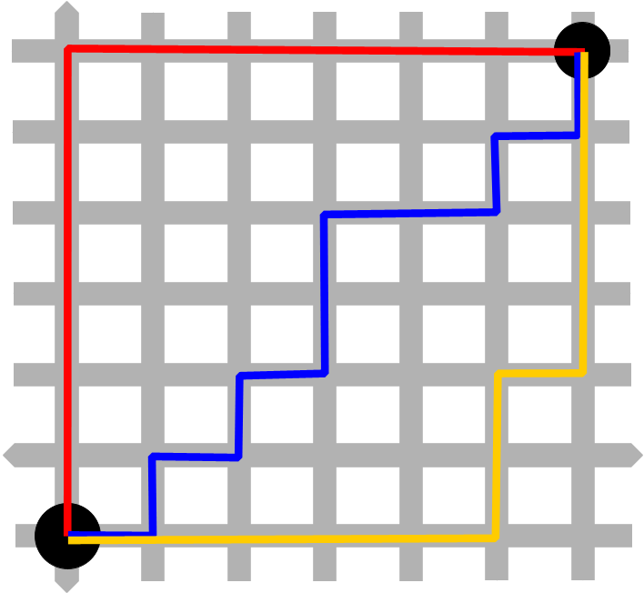
Figure 1. Manhattan distance grid pattern.

In this image, the red, blue, and yellow lines are all different Manhattan distances. Manhattan distance is the simplest distance mathematically to calculate for. Pay special attention to the exponent and the second value in the np.power() function as the other distances are explained.

Euclidian Distance

Euclidian distance can be found by calculating the square root of the sum of all side lengths to the second power, or by using the following formula:

euclidean_distance = np.power((length_side_1 + length_side_2 + ... length_side_n)**2, 1/2)

Euclidian distance is based on the Pythagorean theorem, which is probably familiar to you as a2 + b2 = c 2, as can be seen in Figure 2.

Euclidian distance, gnu license

Another way to view Euclidian distance is as the shortest way to get from one point to another, or ‘as the crow flies’. The primary difference between Manhattan distance and Euclidian distance is that Manhattan can only be used for 2D spaces, whereas Euclidian distance can be used for 3D space, as seen in Figure 3. This means that Euclidian distance is more flexible and can be used for more complex features.

3D Euclidian distance calculation, gnu license

In this image all of the p points are referencing the lower point, just on the three different axes, x, in red, y, in green, and z, in blue. Just as all of the q points are referencing the higher point. This images shows how complex loss functions can be to calculate by hand. In using programming, specifically in this case machine learning, the optimal solution can be found more quickly.

Minkowski Distance

The Minkowski distance is the distance between two points in a normed vector space. A normed vector space is a space in which some sort of norm has been defined. Basically all of that means that Minkowski distance is the distance between two points in which the distance metrics are identified and related to each other, like length in meters or feet. It is a generalization of both Manhattan and Euclidian distance. Minkowski distance can be found by taking the nth root of the sum of all side lengths to the nth power, calculated using the following formula:

minkowski_distance = np.power((length_side_1 + length_side_2 + ... length_side_n)**n, 1/n)

The generalization can be seen in the exponent and the second value in the np.power() function. One caveat to the Minkowski distance is that all values must be positive. That makes it particularly useful when data has been scaled. When data is scaled that normed vector space is created.

Generally, loss is determined by the distance from the intended target to the calculated for variable. The keyword for loss is distance. The maximization or minimization of loss as various potentially correct solutions are tried out allows for “learning” to occur.

Gain

Gain is a little bit different from loss. There are different types of gain that can be calculated for. This category encompasses information gain, entropy, and the Gini index, otherwise known as the Gini penalty. All of these different measures discuss the integrity of the target variable. The target variable is the variable of interest or the variable to be solved for.

Entropy

Entropy, in this case Shannon’s version of it, for the chemist’s out there, is a measure of certainty or uncertainty, and is the measure of the information able to be contained in a variable. Measuring entropy before and after a calculation can allow for “learning” to take place by selecting for entropy to be maximized or minimized.

Entropy can be calculated by using the following function:

def entropy(pi): # where pi is a list of class distributions
    """
    return the Entropy of a probability distribution:
    entropy(p) = - SUM (Pi * log(Pi) )
    """
    from math import log
    total = 0
    for p in pi:
        p = p / sum(pi)
        if p != 0:
            total +=  p * log(p, 2)
        else:
            total += 0
    total *= -1
    return total

Information Gain

Information gain measures how much information a feature gives about a certain class by measuring its impurity, or uncertainty, using entropy. It can be calculated by using the following function:

def IG(D, a): #  take in D as a class distribution array for target class, and a the class distribution of the attribute to be tested
    """
    return the information gain:
    gain(D, A) = entropy(D)− SUM( |Di| / |D| * entropy(Di) )
    """

    total = 0
    for Di in a:
        total += abs(sum(Di) / sum(D)) * entropy(Di)

    gain = entropy(D) - total
    return gain

In the case of this function for information gain, D is the target’s distribution, and a is the calculated variable’s distribution. The letter i in both this information gain and the entropy formula represents the probability of the associated value. So, Di is the probability, or is a single value in the associated distribution list. For information gain, from the total information in a variable, we’re subtracting the likelihood of attaining a certain value. This in essence gives weight to the feature. So things with more weight will be considered more frequently than things with less weight. This skews the “learning” part to the things that are more probable to happen.

Gini Index

The Gini index, or Gini penalty, calculates the probability of being wrong when shooting in the dark. So, it still has a target and a calculated variable. The calculated variable is picked at random and compared to the target variable, and as the number of times the calculated variable is wrong increases, the Gini index also increases. It can be calculated using the following formula:

def gini(pi): # where pi is a list of class distributions
  """
  return the gini index of a class distribution:
  gini(p) = 1 - sum(Pi)**2
  """
  total = 0
  for p in pi:
    p = p / sum(pi)
    if p != 0:
        total += p**2
    else:
        total += 0
  total = 1 - total
  return total

From this function, you can see that there are some similarities between the Gini index and entropy. They both discuss integrity of the calculated values, as does information gain for the class.

Both loss and gain can work together to assist in the “learning” that happens when training a machine learning model. Selecting which type of both to use can have a large impact on the model created in the end. Each type of loss and gain can lend itself to either supervised or unsupervised learning, largely depending on the data structure itself or what the goals of the developed algorithm are.

Supervised Learning

In supervised learning the target variable is known before starting the machine learning process, otherwise known as having labeled data. This means that the target variable and the calculated variable can be directly compared and use any of the distance types in loss for comparison. Also any type of gain can be used to optimize performance.

Unsupervised Learning

In unsupervised learning, one of two things needs to happen before any calculations are done to improve an algorithm. The data is either split into different clusters using a process called k-means or is reduced in dimensionality by eliminating features that don’t contribute information to the dataset. Each point of data is now associated with a cluster or dimension reduction, and this serves as the “label”, or the target variable. Once this is done, then the process for unsupervised learning proceeds similarly to the process for supervised learning in that any of the loss or gain types can be used to increase the accuracy of the model.

So, machine learning uses loss and gain functions as mathematical tools to improve accuracy by either increasing or decreasing the selected value each time the algorithm is run.

Using Data in Branding

When studying for my MBA, during one of the classes I took, we were involved in a business simulation. The eight week class matched up with the eight weeks spent in the simulation. We were given market data and asked to develop and brand a product fit for audiences specific to where we decided to open up businesses. I was the leader in my group and managed all of the branding and design decisions. Our group had the most consistent performance out the eight competing groups and had the lowest overhead. This post aims to summarize what I learned from the experience and what we did differently from the other groups.

The first decision that we made during week one was to cater to a very specific demographic. Our company decisions that followed were based off of this one decision. We wanted to market to a demographic that did not necessarily have the top demand in every place, but was consistently in the top four markets across entire regions and actually in demand in every region we could potentially expand to globally. The specific demographic that ended up matching that was the traveling businessperson. The product that we developed and marketed was a personal computer (pc).

With our target demographic selected and the general product we were going to sell, I worked on developing the specifications of our product. The reason that I ended up working on this part of the project was because I understood the market data about the different kinds of motherboards, GPUs, monitors, and various software availabilities. I looked at what the traveling businessperson wanted from their pcs across the various regions, and made some recommendations for what we should research and develop. With that in the pipeline, I advised my team to hold off on putting out any product out until the research was completed. That forced us to enter the market later. And there was some push back from my team about using that approach. I convinced them that we could capitalize on untapped markets after seeing where others were setting up their main business hubs. They accepted that as a potential benefit to waiting.

While waiting for the research and development (R&D) work to wrap up, I worked with the marketing point about which specifications to highlight in a marketing campaign to start before we pushed out our product. We took all of the data from across several regions and determined that we should highlight two characteristics about our product, first that the pc would be lightweight, and second that the pc would be versatile and able to be used in multiple settings for various types of presentations, this was the research piece we were waiting on. As the marketing campaign wrapped up we were able to push out our product, and had the biggest opening week out of all of our peers. I recommended some other R&D to be completed for an upgraded version of our pc that further expanded into some of the lesser demands of the traveling businessperson to push out for a second marketing campaign.

Part of that first marketing push was a branding brainstorming session, during our second team meeting. We did a round table and everyone contributed a few ideas about words that came to mind when they thought of a traveling businessperson. The purpose of that activity was to name our first product. A few good ideas came through, and ultimately we decided on Aves. That decision we felt reflected the ideals that our business was founded on during week one. We had decided that integrity of product was to be a cornerstone of the business and that transparency was essential. A lot of companies with similar values often name things with Latin names, and that’s the reason why the Latin name won out over some of the other ideas. Honestly, this meeting really pulled everyone together and really unified our approach to the various tasks we were managing. That single word became the answer to every question that could be asked about expansion.

We added a secondary business venture later to market to high end science with a product called Titan, now the name of one of NVIDA’s GPUs. While that was a worthy investment, it did take a lot of our earned revenue for not a whole lot of return. Had the market for that been larger, it would have worked out better. The demand was extraordinarily high, but the market pool wasn’t very deep. We still ended up making a significant profit, largely due to the areas that we decided to open in. We were the first to tap into the African market because our product was the only one out of our peers that could actually be used there due to electrical constraints. We were frontrunners there the entire time. We broke out early in Asia but were overtaken. We grew steadily in Europe and the Americas throughout the game and did overtake some of our competitors.

The biggest thing that I learned throughout this experience was that branding has power. It can unify a team within a company, especially if it is born of the people working on a project. And furthermore, branding creates demand for product. By the end of the simulation, the word travel was synonymous with Aves. The name of our product was born of our selected market demographic. This selection was made by evaluating market data and the company decision about what part of the market to hit the hardest. We looked for that second, third, or even fourth demand of consumers across various regions world wide. In short, branding is backed by data and science.

Letting Your File Names Work for You: Using Python's Pillow Library to Iterate Over File of Images

Lately I’ve found myself needing to open many images at a time to work on a data science project. So, I thought I would share a method to do this without using “hard code”, or using each file name independently, in order to make my code more pythonic.

Depending on how you name you files, you can iterate over them. Using a base string like ‘image’, then following that up with a number, and finally and ending, like ‘.jpg’ allows you to iterate over the files. If you have let’s say twenty-eight images to open, then you can use the following code to store your images in a list so that you can work with them using iteration or looping.

import PIL import Image
path = '../images/'
base = 'image_'
ending = '.jpg'
images = []
for image in range(0, 28):
  images.append(Image.open(path+base+str(image)+ending))

This ‘path + base + iterator + ending’ structure can also work with other python libraries like os and json. The ‘../’ part of the path variable takes you back to your root directory in case you want to access things that are stored in a different file but in the same root directory. And if you have different endings you can use a try/except or an if/elif/else statement with the different endings changing. Also, if your base changes from images to something like red, green, blue because you separated out your images, you can use a nested for loop structure to get at all of the files.

What Goes into a Data Science README file

There are many types of things that could go into a README and there are multiple audiences to consider. An important thing to note is that your README file is what is going to communicate what’s going on in your project, and as such should grow with your project. In this blog post, I’ll discuss what to pull from each part of the OSEMN data science method to show off in your README. Which of course means that your README should be updated as your project progresses. If you have deployed your model, be sure to state that in an introductory paragraph, along with including a link.

Obtain

For this part of the README it’s important to communicate your data sources. Maybe someone else wants to use the same source data or has a question about how to work with your sourced data in the first place. For a technical audience, this may be important. For a non-technical audience, communicating that your data was sourced ethically and potentially creatively will assist with an increase in buy in to what you have to say. Essentially, including this aspect of your README will demonstrate skill in one of the biggest barriers to starting a data science project.

For a visual component, including a sample of the obtained dataset, by looking at the head, or in the case of working with image data, including one of the raw images, wouldn’t be amiss. This will also allow the reader to start seeing how you as data scientist think. Or at least the next visual will. Showing the progress made during a project and the transformations that take place show competency and potentially show of your unique skill set.

Scrub

Here, it will be important to explain the unique steps that were taken to prepare the data for analysis. In this section it will be important to discuss the specific methods taken for the technical audience. Again, this documents your process and allows others to see how you worked with particularly tricky sections. For the nontechnical audience, it might be important to discuss how you know that your data is still representative of the original input data. This discussion will showcase how you might overcome barriers to data analysis.

Explore

In this section, your project should truly begin to shine. Anything that stands out about any features that you may have added should be included. This again shows off your creativity and your ability to problem solve. This is where you can start to stand out against the crowd of other data scientists. Plus, this exploration section is visual heaven. The visuals that can be created are only limited by your knowledge and proficiency. Make sure to include explanations of difficult to interpret graphical relationships for your non-technical audiences.

Be sure to include several visuals. This section is likely what will draw both audiences to look deeper into your project and what you’ve accomplished therein.

Model

Be sure to restate the purpose of the project to connect with your non-technical audience, along with a success or failure statement. Then, in this section, I would include all of the details that you need to talk about this project in a technical interview. How many models were evaluated and the specific criteria of the best model, along with explanations of selected parameters. This is the meat of your project, and should reflect that in the length of your README file.

For the visual of this section, including a loss or accuracy, or other training criteria graph would be an asset to allow technical and possibly non-technical audiences to get a quick look at your model performance. This quick glance will again draw readers into actually reading about your project to see why your performance is so high, potentially higher than their own. Additionally, communicating the steps you took to get there only builds up knowledge within the data science community.

Interpret

This section could a myriad of different things. If your model has been deployed, this can be a great place to talk about the process that was needed to make that happen. Additionally, be sure to restate your business case and explain how your model directly addresses it. Including a general conclusion along with any future work planned for the project might be a good idea. In fact, this might be where your README starts, with that business case and the planned next steps.

In summary, your README should grow along with your project and should be updated with regularity. Make sure that the writing and concepts within accessible to audiences at all levels of proficiency with business and code. That will likely include explaining your logic for each decision made along the way. This logic story can be a great way to prepare for technical interviews. This is what I’ll strive to do in every README that I generate or contribute to anyways.

Preprocessing for Convolutional Neural Network Built with Keras

When working in data science, data is preprocessed to improve model performance. Preprocessing often includes scaling data or transforming it to create an easier to work with distribution. When working with image data this looks a little bit different than it does with numerical or categorical data.

While Keras has some great features in it’s ImageDataGenerator class, there are some things that don’t generalize well across entire datasets from different data sources. Some examples of this include determining the presence of alpha layers or breaking images down into their red, green, and blue components. For these particular applications, I used the library Pillow for a project.

The first thing that I did was determine if any of the images had a preexisting alpha layer using the “.getbands()” method from Pillow’s Image module. One of images I had collected did. I viewed the image without the alpha layer, and ultimately decided to discard that piece of data due to the post processing done by the original artist. The post processing had colorized and isolated aspects of the image, significantly modifying it from the original image data collected from the source fluorescence microscope in order to highlight certain features.

Next, I looked at the sizes of the original images. They were all different, shown below in Table 1.

Width Height
1157 1166
1344 1022
1392 1040
1800 1200
1916 1210
1920 1217
1923 1210
1924 1218
2630 1785
2696 1770
2752 2208
2758 2214
3000 3000
3022 2046
3900 3900
4016 3000
4090 3480
4266 4266
4368 2988
4530 3018
4569 3000
4620 3103
4800 3600

Table 1. Widths and Heights of original image data.

After acquiring the sizes of the images, I found the smallest size for width and height and then found the average ratio between width and height. See code blocks below.

import numpy as np
heights = []
for image in all_images:
    heights.append(image.height)
np.array(heights).min()

output: 1022

widths = []
for image in all_images:
    widths.append(image.width)
np.array(widths).min()

output: 1157

ratios = []
for size in sizes:
    ratios.append(size[0] / size[1])
np.array(ratios).mean()

output: 1.3072131016891209

I used this averaged ratio in combination with the smallest width to find out what an appropriate height would be by using the code below.

new_height = np.array(widths).min() / np.array(ratios).mean()
new_height

output: 885.0890482240253

I then resized all of the images using the code below.

from math import floor
resized = []
for image in all_images:
    resized.append(image.resize((np.array(widths).min(), floor(new_height)), resample=1))
resized[0]

This code will output a resized image from the resized dataset.

The next part of preprocessing that I did using the “.split()” method from Pillow’s Image module. This method splits the original images into their red, green, and blue components. This step is not necessary for preprocessing image data, but I choose to use it because I think that it will led to better performance. I am attempting to classify into two categories, present or not present. In the split images the present information stands out to the human eye; whereas, it does not in the combined RGB image.

I do plan to do additional preprocessing using Keras’ ImageDataGenerator class when ready to start building the neural network. But I thought that these steps would be useful to implement before doing exploratory data analysis.

Security Through Obscurity for Blogging with Jekyll

The question of security of data and models comes up frequently in the world of data science. The way that people talk about security can verge on superstition.

https://xkcd.com/1820/

Today, I’m here to talk about one method to secure blog posts called “Security Through Obscurity”. The general idea is you don’t know what you know. For instance, let’s say that you have a blog on a little trafficked website, but that is under the online handle that you use for everything, and you want to secure certain posts more than other to protect certain types of intellectual property.

Some things to consider in this scenario are that websites tend to follow a predefined url structure for each webpage under the main one, and that it is likely predictable. In fact for this website the code to generate the urls is:

/:year/:month/:day/:title/

This is found in the .yml file for this website. This is relatively predictable, but I don’t follow a posting schedule presently. This adds a random element to the year, month, and day part of the url. The title is made up by me as the title of the blog post. If you wanted to add another layer of protection to protect this url, you could add a randomizer element, like so:

/:year/:month/:day/:title/:randomizer

This randomizer could be a string of text and numbers that is a random length. For instance, I just used random.org to generate ‘MYXprOFQeELrgrViadeM’. If there were a part of my website that I wanted to personally approve people to view, I could add this randomizer in the header of the post while writing. The header for this post is:

layout: post

title: “Security Through Obscurity”

date: 2020-08-18 20:27:37

categories: non-technical, security

paginator: Security Through Obscurity

To add the randomizer, I would modify the header to look like this:

layout: post

title: “Security Through Obscurity”

date: 2020-08-18 20:27:37

categories: non-technical, security

paginator: Security Through Obscurity

radomizer: MYXprOFQeELrgrViadeM

Additionally, the randomizer would need to be added the file name after the title.

When linking to the “secure” post throughout the site, I would leave off the randomizer, and have the 404 page say to contact if the user thinks they should have access to the page. If the user should, like a potential employer trying to see an abstract, then I would send them the randomizer with instructions to append the randomizer to the end of the url to view the page.

And those are the steps I would take to increase security through obscurity for certain posts while blogging.

How NASDAQ Responded to the Events of March 2020

At Dash 2020 hosted by Datadog, I attended a talk given by Brad Peterson and Donald Beery titled “NASDAQ: Market Resiliency in the Age of COVID-19”. This post aims to write up a general schema for contingency planned for managing a large application that has many users with constant contact based on the information I learned during the talk.

The biggest thing that was stressed during the talk by the presenters was open communication across all levels of staff. The reason that NASDAQ was able to respond so efficiently to the stay at home mandates was the practice of that very scenario prior to it being needed. NASDAQ has a contingency plan in place where all of the staff transitioned to working from home, and they practiced executing that contingency plan. Also having backup gateways for staff to login from while working at home was something found to be necessary during these practice runs. Implementing them and practicing them allowed for a seamless work from home set up.

The biggest changes seen in the behind the scenes support at NASDAQ was supporting the increased volume of trading seen in 2020. They also staff at two times the capacity of the previous day, but did work to expand their staffing and software support up to five times capacity by optimizing in the background. This was necessary to meet the demand seen in March 2020.

Fielding this growth was made possible by focusing on these three things while transitioning to a work from home set up. First, connection, then visualization, and lastly communication were the three big focal points for the migration. Connection meant ensuring that every employee had access to internet and was able to configure their own VPN. Visualization actually didn’t refer to video calls, but ensuring everyone had a clear picture of the goals from the meta big picture view down to the minutia of a task list for the day. Communication included not just video and audio chats, but also transcription of those conversations for those that could not connect at that time. For example, there are two team handoffs daily, from the US to Lithuania and back. Part of the shift report exchanged during the handoff might include the transcribed notes from an earlier meeting.

After Hurricane Sandy, eight years ago NASDAQ learned the importance of contingency planning and has put those lessons to use in this unprecedented time.

References: Live Tweet Thread

Proposal for the fluorescent detection of amoxicillin and recommendation for dosage required to eliminate the present infection

Diagnostic testing for disease can take anywhere from three hours to three weeks to complete. If it were possible to observe bacterial interactions with antibiotics in real time, diagnosis could be sped up and an appropriate antibiotic could be prescribed. Currently, Pattern Bioscience is working on such a technology using single cell analysis and deep machine learning. 1 This post will offer up a potential route to evaluate for amoxicillin efficacy. I will be working under the assumption that the deep machine learning technique being used is a convolutional neural network. This type of machine learning is what allows computers to evaluate visual information like photos. If this technique is being used, then the computer will be able to “see” what’s going on at a cellular level. Amoxicillin inhibits a bacteria’s ability to build a cell wall, meaning that over time, amoxicillin will prevent more cell wall from being formed, holes will develop, and the bacterial cell will rupture. 2 This idea of visualizing bacteria in vivo has already been done before with fluorescently labelled vancomycin. 3 In the past, amoxicillin has been prepped for fluorescent analysis in solid phase extraction 4 5, in organic matrices 6 7, and in bacterial cells themselves 8. Other types of antibacterial probes have also been evaluated in bacterial cells. 9

This proposal aims to translate similar principles to the commonly used antibiotic amoxicillin for the purposes of extending from diagnosis using amoxicillin alone to also allowing for quantification of consumed amoxicillin. This could lead to not only a diagnosis and prescription recommendation, but also to a dosage or duration recommendation. For this to work, a fluorescently enabled microscope would be needed to take measurements. The images collected by this microscope would then need to be fed into a convolutional neural network. At first, to build a knowledge base, manually labeling images with bacteria present, not present, and fluorescent tag concentration might be necessary. This labeled data could be used to develop a supervised network for classification of affected/unaffected samples and a regression for fluorescent tag concentration. Once this model is developed, patient samples could be tested against it, with traditional testing serving as a secondary form of validation. Once an acceptable error is reached during the training stages of the model, and it is appropriately validated, the time needed to evaluate a new sample would be similar to the amount of time it would take to collect the necessary input information. Meaning this approach would take the same amount of time as it takes for the bacteria to express the affects of the introduction of the amoxicillin. This rate could be calculated for using a similar approach developed by Dr. Spratt in Properties of the penicillin-binding proteins of Escherichia coli K12. 10

This is but one example of the possibilities of integrating machine learning techniques into the traditional laboratory setting.

References:

1 https://pattern.bio/pattern-secures-13m-in-development-funding/

2 Reed, M. D. (1996). Clinical pharmacokinetics of amoxicillin and clavulanate. The Pediatric Infectious Disease Journal, 15(10), 949-954. https://doi.org/10.1097/00006454-199610000-00033

3 van Oosten, M., Schäfer, T., Gazendam, J. A., Ohlsen, K., Tsompanidou, E., de Goffau, M. C., Harmsen, H. J., Crane, L. M., Lim, E., Francis, K. P., Cheung, L., Olive, M., Ntziachristos, V., van Dijl, J. M., & van Dam, G. M. (2013). Real-time in vivo imaging of invasive- and biomaterial-associated bacterial infections using fluorescently labelled vancomycin. Nature communications, 4, 2584. https://doi.org/10.1038/ncomms3584

4 Brittain, H. G. (2005). Solid-state fluorescence of the trihydrate phases of ampicillin and amoxicillin. AAPS PharmSciTech, 6(3), E444-E448. https://doi.org/10.1208/pt060355

5 Luo, W., & Ang, C. Y. (2000). Determination of amoxicillin residues in animal tissues by solid-phase extraction and liquid chromatography with fluorescence detection. Journal of AOAC International, 83(1), 20-25. https://doi.org/10.1093/jaoac/83.1.20

6 Xie, K., Jia, L., Xu, D., Guo, H., Xie, X., Huang, Y., … & Wang, J. (2012). Simultaneous determination of amoxicillin and ampicillin in eggs by reversed-phase high-performance liquid chromatography with fluorescence detection using pre-column derivatization. Journal of chromatographic science, 50(7), 620-624. https://doi.org/10.1093/chromsci/bms052

7 Crissman, H. A., Stevenson, A. P., Orlicky, D. J., & Kissane, R. J. (1978). Detailed studies on the application of three fluorescent antibiotics for DNA staining in flow cytometry. Stain Technology, 53(6), 321-330. https://doi.org/10.3109/10520297809111954

8 Kocaoglu, O., & Carlson, E. E. (2013). Penicillin-binding protein imaging probes. Current protocols in chemical biology, 5(4), 239–250. https://doi.org/10.1002/9780470559277.ch130102

9 Kocaoglu, Ozden & Carlson, Erin. (2016). Progress and prospects for small-molecule probes of bacterial imaging. Nature Chemical Biology. 12. 472-478. https://dx.doi.org/10.1038%2Fnchembio.2109

10 Spratt, B. G. (1977). Properties of the penicillin‐binding proteins of Escherichia coli K12. European Journal of Biochemistry, 72(2), 341-352. https://doi.org/10.1111/j.1432-1033.1977.tb11258.x

Decision Science and Data Science

I want to explore a new term that I heard at meetup hosted by Inspire11 called “COVID-19 PT. 8 — Data Science in the Midst of a Pandemic”. While discussing what’s needed in communication with data scientists and business partners, a director named Steph Kopa mentioned a term “Decision Science” while we were in a break out room together. It’s not a term I’ve heard before, not coming from a business background. I want to explore what that means.

According to this post by Chris Dowsett, decision science is the skill of using data as a tool to make a decision. He goes on to explain that the role of a data scientist, at least at Instagram, is to evaluate independent projects or features. The decision scientist takes those individuals analyses and compiles them, incorporating what they know of business and of the current environment in which those projects would be rolled out to develop a model that will assist in making a decisions for the company.

My education at Flatiron School focused on incorporating a business case for each project assigned. Sometimes this business case would make developing features for modeling easier, but sometimes when revisiting the business case after a model was developed, I was left with a gap between what my model could do and the original business case. This experience added some color to my conversation with Steph. My background in science allows for the exploration of ideas simply for the sake of exploring a theory. When I mentioned this, Steph shared that when she’s working with her data scientists she often pushes into the question why, asking it until there’s nothing left to answer. I think this might be a good approach to developing the skill of decision science while working as a data scientist. Not to mention, this approach will empower better features and better models by forcing the analyst to think critically about each incorporated component of the model.

In this article, the approach to decision science is mentioned to be different from other analytical approaches. It takes in available information and makes the best choice for the circumstances. This almost reminds me of a project that I did in determining the best product formulation. In this project, first I had to preform statistical analysis for each formulation, exposure, and method of use. Once this testing was done, I laid out a table on paper with my boss that had the results from over 60 statistical tests. From each independent conclusion, we were able to see a trend of which product performed higher with more consistency. The work that I did was in the vein of data science. If my boss and I had extended those same skills to the table that we drew up together, that would probably generate a decision science model.

To conclude, it seems like data science and decision science apply the same skill of analysis but with different frames. Also, it seems like the work that a decision scientist does is an extension of the work generated by a data scientist. It seems like the two roles could work together to generate truly data driven decisions.

e9 Treatments Chemical Storage

This post describes the process I used to design a chemical storage space at e9 Treatments.

At e9 Treatments, while cataloging non-inventory items, chemical storage needed to be addressed. When I arrived, all chemicals and “valuable inventory” was stored in the flammable cabinet because it could be locked. The flammable cabinet was never actually locked. This is an issue because not all chemicals are compatible to be stored together.

The type of chemistry preformed at e9 Treatments dealt with surfaces. This meant that all sorts of organic and some inorganic chemicals were used. The biggest accomplishment for chemical storage was separating out the oxidizers from the flammable items, and creating a new storage space in a different area for these chemicals. Oxidizers need to be stored separately from flammable items because if a fire were to occur, the oxidizers would when burning release more oxygen and fuel for the flames present. Storing them in a separate area reduces the risk of an out of control chemical fire.

Next, the remaining chemicals were sorted into organic and inorganic chemicals and then sorted by their functional group. The functional group is the active part of the chemical that gives it its inherit reactivity. The four major groups ended up being: inorganic salts, alcohols, hydrocarbons and esters, then ethers and halogenated hydrocarbons. The table below, Table 1. shows how these items were arranged in the e9 Treatments Flammable Cabinet.

Alcohols Hydrocarbons and Esters Ethers and Halogenated Hydrocarbons
Alcohols Ethers and Halogenated Hydrocarbons Ethers and Halogenated Hydrocarbons
Alcohols Hydrocarbons and Esters Ether and Halogenated Hydrocarbons

Table 1. Flammable Cabinet Chemical Storage Layout

The major challenge in designing this layout was the difference in bottle sizes. With research and development being a large part of what e9 Treatments does, many of the chemicals were in small 5mL-25mL bottles. The top row, which is bolded in Table 1 was reserved for these types of chemicals. Then items used commonly for production were stored in the second row, the easiest to reach. The less commonly chemicals with large quantities were put on the bottom shelf.

A minimum of three inches of space was maintained between each functional group. Additionally, inorganic salts solutions were stored in the back between the hydrocarbons and esters and the ethers and halogenated hydrocarbons with the same minimum of three inches of space between other groups.

Another big win with this project was clearing the fume hood of chemicals that had been stored there since before I started working with the company.

The idea of storing chemicals by their functional groups is not unique. I picked up this method of chemical storage while working with Schreiner University from 2010-2014. It is based off of the Flinn Chemical Storage Pattern.

Finding All Factors for Any Number

Today, I’d like to share a function I wrote in python with you that returns all factors for any number passed into the function. I found this tool to be useful when working through the problems posted at https://projecteuler.net/. I can foresee this also being useful in the development of other algorithms.

def factors(number):
  '''Finds the all possible factors of the number, and returns a list of potential factors.'''
  divisible_by = range(1, number)
  potential_factors = []
  for i in divisible_by:
    if number%i == 0:
      potential_factors.append(i)
  return potential_factors

This function utilizes modulo division, represented by the “%” in python, to find the factors of the user’s chosen number. In modulo division, the value returned is the remainder. In this case, if the remainder is zero, then the dividend and the devisor can be considered factors. With the number set to be the dividend and the range of values possible from 1 to the number set to be the divisor, any quotient with a remainder of zero will pass the if statement in the factors function above. With this pass, the divisor will be stored as a factor.

To avoid multiples of the same number appearing in the potential_factors list, only the divisor is stored. The quotient, which is also a factor for the number, will be evaluated separately. For instance, for the number 35, the divisor 5 will pass the if statement, since 35%5 = 0, so the divisor 5 will be stored in the potential_factors list. We know that 5 * 7 = 35, so 7 is the matching factor to 5. When the function arrives at 7 in the divisible_by list, the divisor 7 will pass the if statement, since 35%7 = 0, and it will be added to the potential_factors list. Recording the quotient value for each divisor is outside of the scope of what this function requires to operate effectively.

Although we might use the quotient and divisor when solving factor problems algebraically on paper, not all terms are necessary when doing the same work computationally. This is in part due to iteration. Remembering that all of the numbers from 1 to the selected number will be evaluated independently removes the ability to use the shortcut of matching divisors and quotients to find factors.

The thought process for generating the above function looked something like:

  1. List out all of the possible numbers that could be multiplied together to get the chosen number.
  2. See if pairs of possible numbers will match the chosen number.
  3. How do I do know that the pair of potential numbers will match together to produce the chosen number in the first place?
  4. If I divide the chosen number by one of the possible numbers; then, if I get a decimal, it didn’t work. Move on to the next number. If it does work, then save it for later use.

This produced the pseudocode:

  1. Develop a range of possible factors using the chosen number.
  2. Determine if a decimal is present when diving the chosen number by the range of possible factors.
  3. If a decimal is present, do nothing, and continue. If a decimal is not present, store the value.

To conclude, prior knowledge of math can be used to develop functions, in this case, a function to produce all factors for a given number. Sometimes, where we start in the problem solving process looks different than the end result. It’s okay to start thinking in terms of one thing, multiplication in this case, and to swap to another way of thinking, in this case division, when a question can’t be answered by the original terms of thinking.

Comparison of Free App Deployment Platforms for Data Science Models

This review talks about my experiences attempting to deploy a machine learning NLP model utilizing tensorflow, keras, and nltk. I built a neural network, trained it, and fitted it before saving the model using keras’s inbuilt save_model function. I saved the model and weights together in the same h5 file. I wrote a couple of functions to initialize all of things that needed to be loaded, wrote up a function to do all of the preprocessing that needed to happen before being passed into my model and ultimately classified with a prediction function. This app runs quickly utilizing three functions and only two lines of active code. See it here! Before I went to deploy the app I ensured that it worked using local Flask.

Heruko

Heruko was my first choice for deployment. With the local app up and running, there really isn’t any other processing or coding that’s needed if your app is already on github. Theoretically, it’s as simple as connecting the accounts to be ready for deployment. However, heroku does not currently support nltk’s library. I learned this hard way when my build succeeded, but the live page kept showing a 404 error. So, I moved to another popular option.

PythonAnywhere

PythonAnywhere was my next choice. PythonAnywhere takes a bit more set up than heroku does. It is definitely more similar to a workspace. PythonAnywhere offers many more features than just app deployment, which means it’s a bit more tricky to navigate. I found PythonAnywhere’s tutorial for app deployment to be both resourceful and honestly necessary for me to find any form of success. There are a lot more steps required, and more familiarity with software development seems to be a huge plus. I connected my github repo to PythonAnywhere, and started following the tutorial to get started. The first thing that I found was that I had to almost immediately switch to a paid version due to my file sizes being larger than the allowed limit for free accounts. The next thing that I found was setting up a virtual environment was required for my neural network. While this wasn’t hard to do, thanks to the tutorial, it did mean I had to go and check exactly what versions were installed of every library I needed to use in my app. This looks like going to your IDE, for me this meant going back to the jupyter notebook where I had originally built the model, and:

import library
library.__version__

for every library I used.

There’s a lot of information out there about PythonAnywhere and keras conflicts. There seems to be some issues sometimes with tensorflow. Again, I upped the amount I was paying to increase space to allow for the full install of the keras library in my virtual environment. This seemed to work, and the next hurtle for me was configuring the WSGI file. Here, there was a Flask interaction that proved problematic. Most of the flask apps call the py file where their app is located “app.py”. This creates a conflict within the pathing used by PythonAnywhere. I fixed that, or at least thought I had. When I went and looked at the Files page, the file management tool used by PythonAnywhere, I didn’t see the changes I had just pushed up to my github repo. At this moment, I learned what a webhook was, and how to set one up. A webhook in github allows a third party website, like PythonAnywhere to pull down the latest version of a branch from a github repository. To be used in PythonAnywhere, some code setting up the hook must be included somewhere. I couldn’t find out where, either in the app’s py file or in the WSGI file. (If you know the answer to this, please reach out to me in github, thank you!) So, I opted not to do this, and uploaded the changes manually. I also realized that heroku does this automatically during the initial github linking process. Finally, I got some leverage. My app was successfully communicating with the WSGI file. However, the app couldn’t build the model. There seems to be some sort of conflict between the WSGI file and the keras library.

Conclusions

It’s really great to build a model that’s useful. However, the more libraries you use and the more strenuous the computing requirements are can give rise to problems and delay successful deployment. Overall, I learned a lot about how to think about generating a useful model and some of the many requirements involved. Models that show that they work and models that actually do work look very different in practice. Additionally, even if you can run a model locally, you might not be able to deploy online. Different hosting sites support different types of code and require different types of configurations to set up. I didn’t need to change my py file between heroku and PythonAnywhere, but I did need to build different environments in which they would exist.

Analysis Interpretation of Cleaning Overview

I wanted to share the technical details I used to generate an article about cleaning methods for another site. The article summarizes the primary ways to address household cleaning for bacteria and viruses. The cleaning necessary is different, and spoiler alert, cleaning for viruses requires extra steps. This article will explore how I arrived at that conclusion by evaluating the content in each article reviewed. The content evaluation is mostly comprised of looking at graphs. To protect the copyrights of the original content creators, I have linked to the original articles rather than embedding the images within the article. After all, they did spend a lot of time and funding generating the data that we will be discussing today. It doesn’t hurt anyone to click on a link to see what’s being discussed.

Floor cleaning: effect on bacteria and organic materials in hospital rooms

This article can be viewed for free on the publisher’s site.

In the first article, various types of floor cleaning methods are evaluated. You’ll see in both Figure 1 and Figure 2, that two types of bacteria were tested. The graphs show the percentage of the bacteria left after mopping for each test performed. These graphs show a lot of variation. The numbers are generally less in the biotrace study, and it seems like all of the types of mopping are kind of equal at this point.

The differences start to appear much more in Figure 3. In this graph, you see the same information as in the previous two graphs. The primary difference is that Figure 3 shows the averages of all of the studies. The moist and we mopping look very different than the dry and spray mopping, especially in the case of the hygiena study.

Then we see in Table 1 a statistical test that actually communicates whether or not there were differences between the mopping techniques. We see that for the hygiena study the wet technique is better than the dry and spray techniques based on the p-value being less than 0.05. However for the biotrace study there is no difference between the wet technique and the other techniques. The discussion then talks about some of the limitations of the study. It appears that the hygiena and biotrace studies had different scales, and this, of course, will affect the results of the statistics ran. There is no mention of scaling the data to compare results between the two studies. This table is actually what gives the other figures meaning, and is where I drew my conclusions about what to recommend to the reader.

What this communicates is that for some bacteria, moist and wet mopping can reduce the amount of some bacteria present, but not necessarily all bacteria. The reason why I suggested wet mopping over moist mopping in my review comes down to prep time. The moist preparation of the mop includes soaking the mop head in nearly boiling soapy water, wrapping it in plastic, and leaving it alone overnight in an airtight space, like a household dryer. This is not easy to do. Whereas, with the wet method, you get a mop, get some warm water, pour some soap in, mix it up with the mop, and get to mopping, a much more friendly practice, easily adopted for a household.

Additionally, this source illustrates that having a surface wet, dripping wet, is important to reducing bacterial presence. I, personally, think that creating the expectation of a wet floor that has just been mopped, and transferring that expectation to something like a countertop will create a more solid visual for the reader.

Spread of bacteria on surfaces when cleaning with microfibre cloths

The primary researcher for this article has the full text available on her profile at ResearchGate.

The analysis in this article actually looked very different. The measurement metric for success and failure was different, coming from a source outside of the study. A predetermined standard for the acceptable number of bacterial colonies to be present was used to compare against the data collected. The trend of success or failure informed the conclusions generated by the study. Ultimately the author determined that cotton containing cloths transmitted less bacteria than microfiber cloths. A comparison proved to be statistically significant, though the structure of the statistical analysis isn’t clear.

Ability of cleaning-disinfecting wipes to remove bacteria from medical device surfaces

This article’s full text was made available by a Canadian website, Process Cleaning Solutions.

The statistics done in this paper are pretty straight forward. A series of un-paired t-tests were used to determine if a testing group was significantly different from other testing groups. The results are displayed visually in bar graph form with the % CFU remaining on the y-axis, and the treatment on the x-axis. CFU stands for colony forming unit, which is basically, the number of bacterial cells in the remaining in sample after the treatment. This means that, the higher the bar in the graph, the more ineffective the treatment was. The bars also include error bars, which are said to be standard error of the mean. Between three and five repetitions of testing were performed for each type of treatment.

This extent of analysis done in this study shows that bleach and treatment group three out-performed the other types of treatment groups on an unpredictable surface, and that a home bleach solution with a soaked gauze rag performs better than a store bought wipe.

I’m not sure that this is the most through analysis that could have been completed for this study. The sample size is small, and a non-parametric test, a Mann Whitney U specifically, would give more weight to the hypothesis that a store bought wipe will assist in controlling the spread of bacteria. To really hammer home this point, an ANOVA could have been completed. This would actually order the different treatment groups in terms of effectiveness instead of allowing the user to guess based on the visuals present, and this approach would account for the variation present in the mean standard error.

However, the background knowledge that bleach, which is the type of wipe used in treatment group three, is known to breakdown a lipid bilayer goes a long way in supporting the weaker statistics seen in this article. Bleach is basic, with a pH greater than seven, and causes the bonds the bind a lipid bilayer together to break apart. Lipid bilayers exist as the outside layer of all cells, including bacterial cells. So the findings that bleach and treatment group three are effective in lowering the percentage of CFUs is not surprising. What really elevates this study is that the authors evaluated smooth surfaces compared to rough or uneven surfaces. It is in this comparison that the home made bleach with a gauze rag has the most stark effect on remaining bacteria, taking the presence of Staph. aureus down to zero, with no error bar present. This is ultimately, why I am confident in relaying the information that creating your own bleach solution at home, and cleaning with a cotton cloth that can soak the area needing to be cleaned, will powerfully protect against bacteria.

Bacteria on smartphone touchscreens in a German university setting and evaluation of two popular cleaning methods using commercially available cleaning products

This article’s full text was made available for free on the publisher’s website at the time of writing this article.

References

1) Andersen, B. M., Rasch, M., Kvist, J., Tollefsen, T., Lukkassen, R., Sandvik, L., & Welo, A. (2009). Floor cleaning: effect on bacteria and organic materials in hospital rooms.Journal of Hospital Infection,71(1), 57-65.

2) Bergen, L. K., Meyer, M., Høg, M., Rubenhagen, B., & Andersen, L. P. (2009). Spread of bacteria on surfaces when cleaning with microfibre cloths.Journal of hospital infection,71(2), 132-137.

3) Gonzalez, E. A., Nandy, P., Lucas, A. D., & Hitchins, V. M. (2015). Ability of cleaning-disinfecting wipes to remove bacteria from medical device surfaces.American journal of infection control,43(12), 1331-1335.

4) Egert, M., Späth, K., Weik, K., Kunzelmann, H., Horn, C., Kohl, M., & Blessing, F. (2015). Bacteria on smartphone touchscreens in a German university setting and evaluation of two popular cleaning methods using commercially available cleaning products.Folia microbiologica,60(2), 159-164.

5) Gibson, K. E., Crandall, P. G., & Ricke, S. C. (2012). Removal and transfer of viruses on food contact surfaces by cleaning cloths.Appl. Environ. Microbiol.,78(9), 3037-3044.

6) Tuladhar, E., Hazeleger, W. C., Koopmans, M., Zwietering, M. H., Beumer, R. R., & Duizer, E. (2012). Residual viral and bacterial contamination of surfaces after cleaning and disinfection.Appl. Environ. Microbiol.,78(21), 7769-7775.

7) Barker, J., Vipond, I. B., & Bloomfield, S. F. (2004). Effects of cleaning and disinfection in reducing the spread of Norovirus contamination via environmental surfaces.Journal of hospital infection,58(1), 42-49.

Working with NCBI Databases

Updates

In Biopython there are various options with which to work with genetic information. This post will discuss integrating the API call functionality of the online BLAST + database with an email and tool that is registered with NCBI using the Enterz library to obtain sequence information from registered accession numbers. The applications of this type of approach would be to compare genetic information across broad categories, not to identify a sequenced genetic sequence or protein.

First, register your email and project tool with NCBI. This can be done by emailing their office at eutilities@ncbi.nlm.nih.gov with the following information:

  • email
  • tool.

Registration

Your email should be the email with which you are accessing the database. All communications about your project should go through this email. The tool is something that you make up, a project name, something that uniquely identifies what you are working on. NCBI will use both pieces of information to track your data usage while you are accessing the database. Do not access the database before receiving a confirmation email from NCBI that you are registered for use.

API

Second, while you are waiting to hear back, you can register for an API key after creating an NCBI account. This API key will allow you an increase in number of calls per second.

Data Usage Restraints

Third, follow instructions about database usage so as to be courteous to all who are accessing the database. NCBI has posted some rules about usage, along with explaining them in the confirmation email that your email and tool has been registered. For people not actively working in the research field of genomics, access the database between the hours of 9pm EST to 6am EST. Batch your requests for unique identifiers in batch sizes up to two hundred. Without an API key, you may contact the database up to three times per second. With an API key, you many contact the database up to ten times per second.

I’ve included a code snippet showing how to set this up for multiple batches, with an API key.

def get_ncbi_data(api, email, tool, database, ids):
    """To get data from the ncbi blast data base given:
    an API key,
    an email, must be on file with ncbi,
    a tool, must be on file with ncbi,
    the database name to search, and
    the ids to search by in list format."""
    from Bio import Entrez
    import time
    Entrez.api_key = api
    Entrez.email = email
    Entrez.tool = tool
    print('Searching')
    time.sleep(10)
    search_results = Entrez.read(Entrez.epost(database, id=",".join(ids)))
    time.sleep(1)
    webenv = search_results["WebEnv"]
    query_key = search_results["QueryKey"]
    print('Fetching Results')
    results = Entrez.read(Entrez.efetch(db=database, webenv=webenv, query_key=query_key, retmode='xml'))

Time Series Manipulation

Step 1 - Formatting

Before working with time series data, reformat the data to an appropriate format to work with. Formatting is everything when working with time series. It determines whether or not later testing will be successful or fail for strange reasons. The appropriate format to work with is very simple, the datetime information and the variable of interest. However, this means that any labels that go with this information need to be stripped prior to modeling. I would suggest storing the labels separately and iterating through the data and the labels concurrently when working with the model.

Step 2 - Scrubbing

When working with large amounts of data, sometimes it’s easy to miss little data idiosyncrasies that can really affect future modeling. For instance, in a project that I completed, I had all of the values for 349 out of 350 sets of time based data. For that last value, I was missing 78% of the time series data. I ended up backfilling the missing values with the first known value for that dataset.

Step 3 - Setting Up Model Parameters

Time Series data takes a little bit of work to navigate to a fit for an appropriate model. First, seasonal decomposition should be evaluated. I used seasonal_decompose from statsmodels.tsa.seasonal in my time series project. This decomposition shows information about the observed data, the general trend in the data, the seasonality, as well as the residuals. It is the included information about the residuals that I really appreciated about this particular decomposition function. If there is an identifiable pattern in the seasonality graph, determine the pattern for use in seasonal modeling. For my time series project there was a yearly season.

Additionally, the autocorrelation function (ACF) and the partial autocorrelation function (PACF) provide useful information for determining how a time series model should be set up. Ideally, both the ACF and PACF would show random walk data, examples of this can be see below in Figures 1 and 2. Random walk data is preferred for time series modeling because that means that there aren’t any underlying relationships present in the data that would interfere with the ability to make predictions. So, if you have random walk data, then it will be easy for your selected model to make accurate predictions.

ACF random walk 
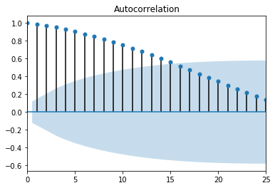
Figure 1. ACF random walk

PACF random walk Figure 2. PACF random walk

These plots, ACF and PACF, can help identify what values to use for the autoregressive (AR), differencing (I), and moving average (MA) parts of an ARIMA or SARIMA model. I used this reference when trying to interpret my ACF and PACF plots. Here, in Figure 2, there is something called lag happening at the PACF value of 1. Notice how the value flips from a positive to a negative value when moving from 1 to 2 on the x-axis. This likely means that the AR value best suited for this data is equivalent to the lag. So, for my p values in a time series model, I would evaluate 0 and 1. If this same pattern appears in the ACF plot, then consider adding an MA value equivalent to where the flip from positive to negative occurs. For this model, I would only evaluate a q value of zero, since the suggested pattern is missing. If the ACF plot is positive for a long time, as seen in Figure 1, then it is likely that a differencing value, or d, will be needed. The level of correlation remains high up to 15 lags, staying over 0.5 out of 1.0, as seen in Figure 1. So the d values that are most likely to work are 0, 1, or 2. If the correlation falls quickly, then I wouldn’t evaluate a d value of 2. Since I choose to evaluate differencing up to a value of 2, it would be wise to include a q value of 1 in the evaluation to compensate for over-differencing.

So, the model for my time series project needs to have a seasonal component, have p values 0 or 1, have d values of 0, 1, or 2, and have q values of 0 or 1.

Step 4 - Setting Up Metrics to Evaluate Model

In the ARIMA fucntion from statsmodels.tsa.arima_model there are two methods predict and forecast. The naming on these methods is misleading. The forecast method uses the generated model to generate predicted values for all dates present in the data passed in. In other words, the forecast method creates your predicted y values. The predict method is specifically for dates not used to create the model. The predict method is what could be used to validate the model.

To prepare for validating the model, data needs to be removed from what will be used to generate the model. So, a train-test split needs to be done. But this split is for time data, so it will look different. Depending on how much history you have in your dataset, you’ll need to chop off a portion at the end for this validation step.

Step 5 - Setting Up Predictions

Predictions are for times outside of the scope of your original data, and help inform decisions about the test case.

Step 6 - Modeling

At this point, you are ready to start modeling and figuring out the best solution for your data.

Types of Statistical Testing

First this topic must be addressed with how statistical testing works. It’s a process that lives and breathes. There’s always another test that can be done, so how do you know for sure that the conclusion is the most appropriate one? First, ensure that all variables to be addressed are being addressed appropriately. Then, once the variables have been isolated appropriately for testing, issues of variance in the data must be evaluated and managed accordingly. Next, is running the first test. This test is then followed by a confirmatory test and/or a non-parametric testing equivalent. Once this information has been ascertained it’s time to give that information power by evaluating the volume and nature of the original data through effect sizes and power studies. Then, evaluation of error might be necessary. At this point, a conclusion might be reached, but more often, something has been illuminated that starts the questioning process all over again, and a new testing cycle is started.

I like to think about statistical testing in a couple of different ways. First, is the data continuous or categorical in nature? Second, is the data parametric or not? The answers to these two questions give a pretty big indication of what type of statistical testing will be appropriate for the obtained data.

P-value

All statistical tests in the following categories, up to confirmation testing, are evaluated against something called a p-value. The p-value is calculated during each test, and the person running the test must decide what level of significance is acceptable for the hypothesis. For something like, what a population’s favorite color is, the risk of being wrong is low, so a p-value of 0.2, or 80% significance, might be acceptable. For the question, does this medicine work, a p-value of 0.02, or 98% significance, would be more acceptable.

Continuous / Parametric

If your data meets these two criteria and has relationships within the variables present, then it’s likely that a regression analysis, used with a true independent variable, or a Pearson’s R test, used with related variables that might have interdependence, is appropriate. However, if there are differences between variables present in the data, it is more appropriate to use a Student’s T-Test for two groups and for an ANOVA for more than two groups.

Continuous / Non-Parametric

Sometimes non-parametric testing can affirm the discoveries in parametric testing, or can supplement when a data transform fails to help the distribution normalize. For relationships within the data, you can use a Spearman’s Rank Correlation. If there are differences present in the dataset, you can use a Mann-Whitney U for two treatment groups and a Kruskal-Wallis for multiple treatment groups.

Categorical / Parametric

In this use case, the diverse Chi Squared test is advantageous.

Categorical / Non-Parametric

For this particular circumstance, a Fisher’s Exact test can be used if the samples are unrelated and in two groups. If the samples are paired, then a McNemar’s test can be used.

Completing one of these types of testing is the beginning of what a machine learning model looks like. The results of these tests in the form of a p-value can tell us whether or not to move on to developing model architecture.

References

These websites contain images that I like to use as reference to remind me of all of the above. I referenced them while writing up this article.

1) Osborne Nishimura Lab Summer 2019 Statistics Workshop 2) Dr. Robert Gerwien’s A Painless Guide to Statistics

While Determining Housing Price, I Learned...

Data Science is an art. Each decision in the process can lead to different results. A certain type of intuition can help in navigating the pathway to an appropriate model. Creativity also makes an appearance in developing features and in creating links between variables. This post’s purpose is to describe the flow of the data science process from idea, to data acquisition, to learning about the data, and finally to model development.

Obtain

In this first step, the data scientist begins to get a taste for what future work might be in store for a project. It starts with a business case, a question, a real world problem. Once the type of data to address the beginning case, question, problem is established, then it’s time to acquire the dataset. For this discussion, I will be using the King’s County Seattle Housing Prices dataset. It can be found here.

import pandas as pd
df = pd.read_csv('kc_house_data.csv', index_col=0)
id date price bedrooms bathrooms sqft_living sqft_lot floors waterfront view condition grade sqft_above sqft_basement yr_built yr_renovated zipcode lat long sqft_living15 sqft_lot15
7129300520 10/13/2014 221900.0 3 1.00 1180 5650 1.0 NaN 0.0 3 7 1180 0.0 1955 0.0 98178 47.5112 -122.257 1340 5650
6414100192 12/9/2014 538000.0 3 2.25 2570 7242 2.0 0.0 0.0 3 7 2170 400.0 1951 1991.0 98125 47.7210 -122.319 1690 7639
5631500400 2/25/2015 180000.0 2 1.00 770 10000 1.0 0.0 0.0 3 6 770 0.0 1933 NaN 98028 47.7379 -122.233 2720 8062
2487200875 12/9/2014 604000.0 4 3.00 1960 5000 1.0 0.0 0.0 5 7 1050 910.0 1965 0.0 98136 47.5208 -122.393 1360 5000
1954400510 2/18/2015 510000.0 3 2.00 1680 8080 1.0 0.0 0.0 3 8 1680 0.0 1987 0.0 98074 47.6168 -122.045 1800 7503

Initially upon first observation of the head, there are several things that begin to dictate what next steps might be. There are ‘NaN’s, or not a number values, in the dataset, a lot of the data even though it seems to an integer or float value is actually categorical in nature, and the years in the ‘yr_renovated’ and ‘floor’ columns have floats, but need to be integers. These three things are going to be considered throughout the course of this project, beginning with the ‘NaN’ values.

Scrub

Not a Number Data

First, let’s consider ‘NaN’ values. To see how many values are present in the entire dataset, run the following code.

df.isna().sum()
date                0
price               0
bedrooms            0
bathrooms           0
sqft_living         0
sqft_lot            0
floors              0
waterfront       2376
view               63
condition           0
grade               0
sqft_above          0
sqft_basement       0
yr_built            0
yr_renovated     3842
zipcode             0
lat                 0
long                0
sqft_living15       0
sqft_lot15          0
dtype: int64

The three variables ‘waterfront’, ‘view’, and ‘yr_renovated’ have ‘NaN’ values. However, addressing these values can be done in various ways. While dropping the rows of data containing the ‘NaN’ values is an option, that means loosing potentially useful data. For this dataset, the number of ‘NaN’s for ‘waterfront’ represents 11% of the dataset, the number of ‘NaN’s for ‘view’ represents 0.29% of the dataset, and the number of ‘NaN’s for ‘yr_renovated’ represents over 17% of the dataset. This can be found with the following code:

print(df['waterfront'].isna().sum() / len(df['waterfront']))*100)
print(df['view'].isna().sum() / len(df['view']))*100)
print(df['yr_renovated'].isna().sum() / len(df['yr_renovated']))*100)

Just dropping all of those rows would cause a loss of almost a third of the original data we started with. To maintain this data without changing the overall shape and distribution of the data present, ‘NaN’s can be replaced with the mean, median, or mode. This is called backfilling. For this dataset, I opted to use the mode. The ‘waterfront’ data is either a 0 or a 1, meaning yes waterfront or no waterfront. And if the home had been renovated, the ‘yr_renovated’ data provides the year, if the home had not been renovated, then a zero is filled in. In selecting mode to backfill, the most common occurrence of this type of data will be used. In the case of renovations and waterfront property, I feel like the mode, which is zero for both, will most likely describe the case of the property in any case. Since the ‘view’ ‘NaN’ data is such a small amount, I opted to drop those rows, although the same argument could be made to backfill with the mode for this data type.

df.loc[:,'waterfront'] = df.loc[:,'waterfront'].fillna(value=df.waterfront.mode())
df.loc[:,'yr_renovated'] = df.loc[:,'yr_renovated'].fillna(value=df.yr_renovated.mode())
df = df.dropna()
# to ensure that all of the NaNs are gone
df.isna().sum()

Now that this big concern established from viewing the head in the obtain step is addressed, some general information about the data needs to be evaluated.

df.info()
<class 'pandas.core.frame.DataFrame'>
Int64Index: 21534 entries, 7129300520 to 1523300157
Data columns (total 20 columns):
date             21534 non-null   object
price            21534 non-null   float64
bedrooms         21534 non-null   int64
bathrooms        21534 non-null   float64
sqft_living      21534 non-null   int64
sqft_lot         21534 non-null   int64
floors           21534 non-null   float64
waterfront       21534 non-null   float64
view             21534 non-null   float64
condition        21534 non-null   int64
grade            21534 non-null   int64
sqft_above       21534 non-null   int64
sqft_basement    21534 non-null   object
yr_built         21534 non-null   int64
yr_renovated     21534 non-null   float64
zipcode          21534 non-null   int64
lat              21534 non-null   float64
long             21534 non-null   float64
sqft_living15    21534 non-null   int64
sqft_lot15       21534 non-null   int64
dtypes: float64(8), int64(10), object(2)
memory usage: 3.5+ MB

Here, what we’re looking for is the data types. There are two types of data in this dataset that have object data. Object data often contains a mixture of integer and string values, and as such cannot be evaluated or interacted with by the methods for either category. Object data needs to be addressed before moving forward. Everything else is either an integer or a float, but from our initial look at the data, some of these might actually be better suited as category data.

Object Data

Conclusions

The biggest thing that I learned in evaulating the King County Seattle Housing Dataset is that math is art and on the meta level tells you about itself. Optimizing for linear regression is like a river that ebbs and flows where the stream is adjusted by its surroundings. Basically, observation of what is present in data can lead you to next steps. If you ever get stuck, reevaluate the data and pick at the anomalies until the path forward is clear. This results in a stronger model overall, and allows your creativity to shine.

Where Data Science and Traditional Science Collide

The word science illicits images of plants and microbiomes, the color changes from chemical reactions and Bohr’s atomic models, and systems interacting kinetically and on the quantum level. Data science, however, drives these dancing figures to a halt as numbers take over. Data science is the creation of a model from interpreted data for the purposes of making informed decisions based on feature analysis. From a research standpoint, this data science perspective addresses the primary goal of all research: how can I display what I have discovered in order to communicate my results to various audiences effectively? With this connection in place, there must be additional similarities between what I know as a scientist and what haver learned as a data scientist. To discover where these points of overlap are, I will evaluate the methodology commonly used by which each discipline.

The Scientific Method

The scientific method is largely agreed on by the scientific community as the following:

Scientific Method Figure 1. The Scientific Method as an Ongoing Process

Typically, the process starts with an internal Observation of the world followed by a Question pertaining to the observation, generally sparked by curiosity. Then a Hypothesis to test is derived from the question and observation, typically about a relationship between observed objects. Next, the studier will make a Prediction about what will happen when testing occurs. Subsequently this a test Design is developed the Test is performed with the collection of data. Then an Analysis of the data is done and a working Theory is developed. This results in starting the process over again or generating new observations based on the working theory.

The Data Science Method

A common data science process is shown below in Figure 2.:

OSEMN Data Science Method Figure 2. The OSEMN Data Science Method

Many data science methods begin in a similar place, with a background exploration.Or more commonly, with a question about the validity of a potential pattern in a business case. After the business context is developed, data gathering, also known as Obtain begins. This can occur in many different fashions: data gathered from a database generated internally from within a company, data gathered from an external database, data gathered from websites that provide access to data, to web scraping. After this occurs, the data scientist will do what is known as Scrub. In this step of the process all of the data that was gathered is transformed into a usable form for modeling. This will often start with making sure that continuous data is labeled appropriately as integer or float data, and that categorical data is handled appropriately either by binning or one hot encoding.After usable data is generated, a data Explore is conducted. At this point,the data scientist will run some statistics to understand the composition of the dataset, introduce useful features that expand upon the original data passed in, and develop some visuals to assist with import relationships in the data. To prepare for the next step Model, a test-train, and sometimes validation split is performed to maintain the integrity of the data passed into the model, and the model itself. The statistics and data exploration performed earlier will inform the data scientist what types of modeling will be appropriate for the question developed in the Obtain stages. After modeling, the data scientist must iNterpret what is happening in the model. In this stage conclusions are reached, and based on these conclusions a solution is developed and deployed.

The methodologies for both science and data science, respectively are below:

  1. Observe - Obtain
  2. Question - Scrub
  3. Hypothesize - Explore
  4. Predict - Model
  5. Design - Interpret
  6. Test
  7. Analyze
  8. Theorize

Differences

At first glance, I see the science method seems to be longer than the data science method. Also in the science method, there is a lot of thinking happening in the following steps: observation, question, hypothesis, prediction, design, theory. In the data science method, the only outwardly obvious thinking type step is interpret. Most of the other steps seem to be quite active with a physical output. In this science method, all of the steps have a physical output, but explain in words a thought process, except for test which outputs data, and analyze which outputs an equation. Each step in the data science method has varying outputs: from data, to a data frame, to graphs and visuals, to an equation, to an interactive tool.

Similarities

Although these two processes sound very different, it has been my experience that they are framed similarly. The focus within the frame, however, is in two different places. The scientific method focuses more energy prior to scientific testing. Whereas, the OSEMN method focuses more on what happens after scientific testing. I think that despite these differences, these two fields of study merge together very well. The science observations give meaning and context to the data that is later to be studied. The interpretation and deployment steps in the data science method give meaning to the results produced my that aforementioned observation. Not only do the results have meaning, but there is an emphasis on making the results accessible especially to those that don’t understand how the model was generated.

Effects

I wonder if, moving forward, knowing data science will give a scientist a better format to communicate results to superiors and editors; and if knowing science will give a data scientist the tools to ask better questions during the obtain stages in order to generate more meaningful features that lead to better models. I wonder if these two fields, which are considered separate today, will merge. I wonder if these two fields will celebrate over the shared knowledge of test/model design and statistics.

Conclusions

To conclude, while these processes come from different desires and currently deliver to different audiences, I think they are different enough to learn from each other, and similar enough to find common ground.

Sources:

  • Garland, Jr., Theodore. “The Scientific Method as an Ongoing Process”. U C Riverside. Archived from the original on 19 Aug 2016.
  • Shearer, C. (2000) The CRISP-DM Model: The New Blueprint for Data Mining. Journal of Data Warehousing, 5, 13-22.
  • https://miro.medium.com/max/1935/1*eE8DP4biqtaIK3aIy1S2zA.png